
 附控控件
附控控件
# FastWeb 附控控件
# 1. TUgFSButton
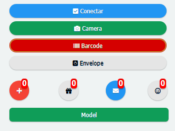
该组件显示为一个按钮。其功能与TUgButton类似。不同的是此按钮可提供更多的自定义样式的选择。
# 1.1. 属性
| 名称 | 说明 |
|---|---|
| BadgeText | 用于设置徽章中显示的文本信息 |
| Caption | 按钮显示的文字内容 |
| CaptionIconFont | 设置按钮显示的字体图标 |
| IconAlign | 设置字体图标相对于文本的位置 |
| Scale | 设定显示的倍率大小 |
| ScaleButton | 倍率按钮显示 |
| StyleButton | 按钮的样式选择 |
# 1.1.1. BadgeText
property BadgeText: TUniFSBadgeText;
设置按钮徽标的显示以及其中的文本显示。
# 1.1.1.1. BackgroundColor
property BackgroundColor: string;
设置徽章的背景颜色,此处的颜色值以CSS颜色为基准。若需要了解在此处可使用的颜色表达式,请查看<color> (opens new window)。
# 1.1.1.2. Text
property Text: string;
设置徽标上可显示的文本信息。
# 1.1.1.3. TextColor
property TextColor: string;
设置文本的着色类型,此处的颜色值以CSS颜色为基准。若需要了解在此处可使用的颜色表达式,请查看<color> (opens new window)。
# 1.1.1.4. TextSize
property TextSize: Integer;
设置徽标文本显示的大小。
# 1.1.1.5. TextStyle
property TextStyle: string;
设置徽标文本的样式类型,可设置项为bold或者normal。
# 1.1.1.6. Visible
property Visible: Boolean;
设置徽章是否显示。
# 1.1.2. Caption
property Caption: String;
设置按钮中显示的字幕的内容。
# 1.1.3. CaptionIconFont
property CaptionIconFont: string;
设置按钮中显示的文本图标的HTML定义内容。格式样式如下:
<i class="fas fa-plus"></i>
所有可用的文本图标的样式请查阅https://fontawesome.com/v5.0/icons (opens new window)。
# 1.1.4. IconAlign
property IconAlign: TUniIconAlign;
设置按钮中文本图标相对于文本的位置。
| 名称 | 说明 | 图例 |
|---|---|---|
| iaLeft | 图标相对于文本居于左侧 |  |
| iaTop | 图标相对于文本居于顶部 |  |
| iaCenter | 当文本内容无显示时图标居中 |  |
| iaRight | 图标相对于文本居于右侧 |  |
| iaBottom | 图标相对于文本居于底部 |  |
# 1.1.5. Scale
property Scale: TUniButtonScale;
设置按钮中图标显示的大小。通过选项的方式来进行设置。
# 1.1.6. StyleButton
property StyleButton: TStyleButton;
设置按钮可显示的样式。可通过下拉选框的方式来选择
# 2. TUgFSToggle
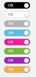
该组件显示为一个滑动开关,点击实现动态的滑动,以达到开关显示的效果。
# 2.1. 属性
| 名称 | 说明 |
|---|---|
| ThemeOff | 关闭状态的颜色 |
| ThemeOn | 开启状态的颜色 |
| TitleOff | 关闭状态下显示的文字标题 |
| TitleOn | 开启状态下显示的文字标题 |
| Toggled | 开关是否处于开启状态 |
# 2.1.1. ThemeOff
procedure ThemeOff: TThemeToggle;
设置关闭状态下按钮显示的样式颜色,可从下拉选框中选择颜色主题样式。
# 2.1.2. ThemeOn
procedure ThemeOn: TThemeToggle;
设置开启状态下按钮显示的样式颜色,可从下拉选框中选择颜色主题样式。
# 2.1.3. TitleOff
property TitleOff: string;
设置关闭状态下显示的文字标题。
# 2.1.4. TitleOn
property TitleOn: string;
设置开启状态下显示的文字标题。
# 2.1.5. Toggled
property Toggled: Boolean;
设置开关当前的状态,当设置为True时,开关为On状态,反之,开关为Off状态。
# 2.2. 事件
| 事件 | 触发条件 |
|---|---|
| OnToggled | 当开关状态切换时触发该事件 |
# 3. TUgFSMenuButton

此控件的功能与用法与TUgMenuButton相同。此控件相较于TUgMenuButton可提供更多的自定义样式。关于其样式的设置说明请参考TUgFSButton。
# 4. TUgFSToast
该组件为弹出式提示信息框,根据需要可以在控件中设置要显示的内容,执行相应的方法来显示自行定制的信息。

# 4.1. 属性
| 名称 | 说明 |
|---|---|
| Balloon | 设置为气球模式,提示框的进度条会显示在提示框的顶部 |
| BackgroundColor | 设置背景颜色,颜色设定的文本样式为RGB(118,23,224),其中的三个数值的取值范围均为0-255 |
| ButtonCustomActive | 设置是否显示在提示框中显示自定义的按钮 |
| ButtonCustomText | 设置显示于自定义按钮中的文字 |
| ButtonTextNo | 设置显示于No按钮上的文字 |
| ButtonTextYes | 设置显示于Yes按钮上的文字 |
| Close | 设置是否在提示框中显示关闭按钮 |
| CloseOnClick | 设置是否使用单击以关闭提示框的功能 |
| CloseOnEscape | 设置是否使用按esc以关闭提示框的功能 |
| Drag | 设置提示框是否支持鼠标的拖动操作 |
| Icon | 设置提示框中使用的字体图标,示例的字体图标表示格式为far fa-user-circle可用的字体图标列表查看https://fontawesome.com/v5.0/icons (opens new window) |
| iconColor | 设置提示框中字体图标的颜色,颜色设定的文本样式为RGB(118,23,224),其中的三个数值的取值范围均为0-255 |
| Layout | 设置显示的布局样式,可选择的样式为SmallInt(最小化布局)以及Medium(中等布局) |
| Msg | 设置显示于提示框中的信息内容 |
| MsgColor | 设置显示于提示框中的信息的文本颜色 |
| MsgLineHeight | 设置显示于提示框中的信息的行高度 |
| MsgSize | 设置显示于提示框中的信息的字体大小 |
| PauseOnHover | 设置当鼠标悬停在提示框上时进度条暂停移动 |
| Position | 设置提示框显示的位置bottomCenter:提示框显示于底部居中位置bottomLeft:提示框显示于底部左侧位置bottomRight:提示框显示于底部右侧位置center:提示框显示于中心位置topCenter:提示框显示于顶部中心位置topLeft:提示框显示于顶部左侧位置topRight:提示框显示于顶部右侧位置 |
| ProgressBar | 设置是否显示提示框中的进度条 |
| ProgressBarColor | 设置提示框中的进度条显示的颜色,颜色设定的文本样式为RGB(118,23,224),其中的三个数值的取值范围均为0-255 |
| ResetOnHover | 当鼠标悬停在提示框上时进度条的进度是否被重置 |
| Theme | 设置提示框显示的主题配色样式,可选项有Dark与Light |
| TimeOut | 设置提示框的默认超时时间,以毫秒为单位 |
| Title | 设置显示的提示框标题 |
| TitleColor | 设置显示的提示框标题的颜色,颜色设定的文本样式为RGB(118,23,224),其中的三个数值的取值范围均为0-255 |
| TitleLineHeight | 设置显示的提示框标题的行高度 |
| TitleSize | 设置显示的提示框标题的文字字体大小 |
| ToastOnce | 设置是提示框信息否仅显示一次 |
| TransitionIn | 设置开始显示提示框信息时的动画样式 |
| TransitionOut | 设置提示框显示消失时的动画样式 |
# 4.2. 事件
| 名称 | 说明 |
|---|---|
| OnClosePopup | 当关闭对话框时触发事件 |
| OnShowPopup | 当显示对话框时触发事件 |
| OnClickPopup | 当点击对话框时触发事件 |
| OnQuestionCallBack | 当使用问题的对话框,点击其中的按钮时触发事件 |
# 4.2.1. OnQuestionCallBack
当使用问题的对话框,点击其中的按钮时触发事件。事件使用的示例如下。
//JScript
function UgFSToast01OnQuestionCallBack(toastbutton)
{
  //表示点击确认按钮
  if (toastbutton == 6)
  {
    ShowMessage("Yes");
  }
  //表示点击取消按钮
  if (toastbutton == 7)
  {
    ShowMessage("No");
  }
}
2
3
4
5
6
7
8
9
10
11
12
13
14
//PasScript
procedure UgFSToast01OnQuestionCallBack(toastbutton: integer);
begin
  //表示点击确认按钮
  if toastbutton = 6 Then
  Begin
    ShowMessage('Yes');
  End;
  //表示点击取消按钮
  if toastbutton = 7 Then
  Begin
    ShowMessage('No');
  end;
end;
2
3
4
5
6
7
8
9
10
11
12
13
14
// Make sure to add code blocks to your code group
# 4.3. 方法
# 4.3.1. Show
procedure Show;
当使用属性中设置的项目时,调用此方法可显示自定义的样式信息。
//JScript
  UgFSToast01.ButtonCustomActive = True;
  UgFSToast01.ButtonCustomText = "Text Button";
  UgFSToast01.Title = "Title Message";
  UgFSToast01.Msg = "Hi, you have new message";
  UgFSToast01.Show;
2
3
4
5
6
//PasScript
  UgFSToast01.ButtonCustomActive := True;
  UgFSToast01.ButtonCustomText := 'Text Button';
  UgFSToast01.Title := 'Title Message';
  UgFSToast01.Msg := 'Hi, you have new message';
  UgFSToast01.Show;
2
3
4
5
6
// Make sure to add code blocks to your code group
# 4.3.2. Success
procedure Success(Title: string; Msg: string);
显示运行成功样式的提示信息。
//JScript
  UgFSToast01.Success("Progress","Success");
2
//PasScript
UgFSToast01.Success('Progress','Success');
2
// Make sure to add code blocks to your code group

# 4.3.3. Info
procedure Info(Title: string; Msg: string);
显示提示信息。
//JScript
  UgFSToast01.Info("Progress","In Progress");
2
//PasScript
UgFSToast01.Info('Progress','In Progress');
2
// Make sure to add code blocks to your code group

# 4.3.4. Warning
procedure Warning(Title: string; Msg: string);
显示警告提示信息。
//JScript
UgFSToast01.Warning("Progress","Canceled");
2
//PasScript
UgFSToast01.Warning('Progress','Canceled');
2
// Make sure to add code blocks to your code group

# 4.3.5. Error
procedure Error(Title: string; Msg: string);
显示错误提示信息。
//JScript
UgFSToast01.Error("Progress","Error");
2
//PasScript
UgFSToast01.Error('Progress','Error');
2
// Make sure to add code blocks to your code group

# 4.3.6. Question
procedure Question(const Title: string; const Msg: string;);
设置提问。
//JScript
UgFSToast01.Question("Question","Do you know about FastWeb?");
2
//PasScript
UgFSToast01.Question('Question','Do you know about FastWeb?');
2
// Make sure to add code blocks to your code group
# 4.3.7. CloseAll
procedure CloseAll;
关闭所有的对话框。
# 5. TUgFSiGrowl
该组件显示为一个消息提示的控件。通过调用方法,执行自定义的文本内容,以达到显示的效果。

# 5.1. 属性
| 名称 | 说明 |
|---|---|
| AlertSize | 设定信息框的大小,可设定两种样式:Regular或者Small |
| Delay | 设定从开始显示提示框至子哦对那个关闭提示框的时间间隔,以毫秒为单位 |
| EnableAnimation | 设定是否启用动画效果 |
| EnterAnimaition | 设定显示提示框时的动画效果 |
| ExitAnimation | 设定提示框消失时的动画效果 |
| Icon | 设定提示框中显示的图标的类型 |
| Messages | 设定显示的提示框中显示的消息 |
| OffsetX | 设定提示框显示的位置的横向偏移量 |
| OffsetY | 设定提示框显示的位置的纵向偏移量 |
| PlacementX | 设定提示框显示的横向相对位置 |
| PlacementY | 设定提示框显示的纵向相对位置 |
| Spacing | 设定提示框之间显示时的像素间隔 |
| Title | 设定提示框显示的文本标题 |
| Types | 设定显示的提示框类型,不同的选项可适用于不同的场景 |
# 5.2. 方法
# 5.2.1. Run
procedure Run;
当使用属性设定自定义的提示框样式后,使用此方法可显示自定义样式的提示框。
# 5.2.2. Success
procedure Success(const Title: string; const Msg: string);
显示成功提示信息。
//JScript
UgFSiGrowl01.Success("Progress","Success");
2
//PasScript
UgFSiGrowl01.Success('Progress','Success');
2
// Make sure to add code blocks to your code group

# 5.2.3. Info
procedure Info(const Title: string; const Msg: string);
显示提示信息。
//JScript
UgFSiGrowl01.Info("Progress","In Progress");
2
//PasScript
UgFSiGrowl01.Info('Progress','In Progress');
2
// Make sure to add code blocks to your code group

# 5.2.4. Warning
procedure Warning(const Title: string; const Msg: string);
显示警告提示信息。
//JScript
UgFSiGrowl01.Warning("Progress","Canceled");
2
//PasScript
UgFSiGrowl01.Warning('Progress','Canceled');
2
// Make sure to add code blocks to your code group

# 5.2.5. Error
procedure Error(const Title: string; const Msg: string);
显示错误提示信息。
//JScript
UgFSiGrowl01.Error("Progress","Error");
2
//PasScript
UgFSiGrowl01.Error('Progress','Error');
2
// Make sure to add code blocks to your code group

# 5.2.6. Simple
procedure Simple(const Title: string; const Msg: string);
设置显示简单的提示信息。
# 6. TUgFSPopup
此控件可用于显示弹出式的列表,可用于额外的菜单项目的展示。
# 6.1. 属性
| 名称 | 说明 |
|---|---|
| ArrowLocation | 设定列表的箭头显示的方向left:箭头显示于弹出列表的左侧right:箭头显示于弹出列表的右侧bottom:箭头显示于弹出列表的底部top:箭头显示于弹出列表的顶部none:不显示箭头 |
| DismissDelay | 设定忽略提示的时长,以毫秒为单位 |
| FadeInDuration | 设定显示弹出列表的动画的持续时长,以毫秒为单位 |
| FadeOutDuration | 设定弹出列表的动画消失时持续的时长,以毫秒为单位 |
| Html | 设定列表中显示的内容,以html文本的方式来进行展示 |
| PopupEvent | 设定弹出列表需要触发的事件类型,可选的项目为click,表示通过点击控件来触发弹出列表的事件 |
| RelativePosition | 设定弹出列表的相对位置 |
| RelativeX | 设定弹出列表横向的位置偏移量 |
| RelativeY | 设定弹出列表纵向的位置偏移量 |
| Target | 设定弹出列表绑定的控件对象 |
# 6.1.1. RelativePosition
property RelativePosition: TRelativePosition;
设定弹出列表的相对位置。可设置的项目说明如下。
| 名称 | 说明 | 图例 |
|---|---|---|
| b_t | 弹出列表的底部与绑定控件的顶部对齐,且水平居中 |  |
| b_b | 弹出列表的底部与绑定控件的底部对齐,且水平居中 |  |
| bl_tr | 弹出列表的左下角与绑定控件的右上角对齐 |  |
| br_tl | 弹出列表的右下角与绑定控件的左上角对齐 |  |
| c_c | 弹出列表的中心与绑定控件的中心齐平,且水平居中 |  |
| l_l | 弹出列表的左侧与绑定控件的左侧对齐,且垂直居中 |  |
| l_r | 弹出列表的左侧与绑定控件的右侧对齐,且垂直居中 |  |
| r_l | 弹出列表的右侧与绑定控件的左侧对齐,且垂直居中 |  |
| r_r | 弹出列表的右侧与绑定控件的右侧对齐,且垂直居中 |  |
| t_b | 弹出列表的顶部与绑定控件的底部对齐,且水平居中 |  |
| t_t | 弹出列表的顶部与绑定控件的顶部对齐,且水平居中 |  |
| tr_bl | 弹出列表的右上角与绑定控件的左下角对齐 |  |
| tr_br | 弹出列表的右上角与绑定控件的右下角对齐 |  |
# 6.2. 事件
# 6.2.1. OnEvents
设定其中的项目的点击事件,完整的设置以及响应方式如下。
//JScript
var SB;
function UgFSPopup02OnEvents(eventname,params)
{
if (Params.Values["act"] == "act1"){
ShowMessage("one");
}
if (Params.Values["act"] == "act2"){
ShowMessage(Params.Values["cod"]);
}
}
{
SB = new TStringBuilder();
try{
//绑定事件1
SB.Append("<a onClick=ajaxRequest("+UgFSPopup02.JSName+",'popup',['act=act1','cod=125']); style='cursor: pointer;'");
SB.Append(" class='fs-group-item'><i class='fas fa-lg fa-user-check text-blue'></i> AAA</a>");
//绑定事件2
SB.Append("<a onClick=ajaxRequest("+UgFSPopup02.JSName+",'popup',['act=act2','cod=126']); style='cursor: pointer;'");
SB.Append(" class='fs-group-item'><i class='far fa-lg fa-envelope text-green'></i> BBB</a>");
UgFSPopup02.SetHtml(SB.ToString);
}
finally{
FreeAndNil(SB);
}
}
2
3
4
5
6
7
8
9
10
11
12
13
14
15
16
17
18
19
20
21
22
23
24
25
26
27
28
29
//PasScript
var
SB: TStringBuilder;
procedure UgFSPopup02OnEvents(eventname: string;params: tunistrings);
begin
if Params.Values['act'] = 'act1' then
ShowMessage('one');
if Params.Values['act'] = 'act2' then
ShowMessage(Params.Values['cod']);
end;
begin
SB := TStringBuilder.Create;
try
//绑定事件1
SB.Append('<a onClick=ajaxRequest('+UgFSPopup02.JSName+',''popup'',[''act=act1'',''cod=125'']); style=''cursor: pointer;''');
SB.Append(' class=''fs-group-item''><i class=''fas fa-lg fa-user-check text-blue''></i> AAA</a>');
//绑定事件2
SB.Append('<a onClick=ajaxRequest('+UgFSPopup02.JSName+',''popup'',[''act=act2'',''cod=126'']); style=''cursor: pointer;''');
SB.Append(' class=''fs-group-item''><i class=''far fa-lg fa-envelope text-green''></i> BBB</a>');
UgFSPopup02.SetHtml(SB.ToString);
finally
FreeAndNil(SB);
end;
End.
2
3
4
5
6
7
8
9
10
11
12
13
14
15
16
17
18
19
20
21
22
23
24
25
26
27
// Make sure to add code blocks to your code group
使用以上方式进行绑定后,列表中显示的内容可响应事件。
# 6.3. 方法
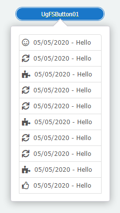
# 6.3.1. SetHtml
procedure SetHtml(Value: string);
设定要显示的HTML内容。
//JScript
var SB;
SB = TStringBuilder;
try{
SB.Append("<a class='fs-group-item'><i class='far fa-smile fa-lg text-green'></i> 05/05/2020 - Hello </a>");
SB.Append("<a class='fs-group-item'><i class='fas fa-sync fa-lg text-green'></i> 05/05/2020 - Hello </a>");
SB.Append("<a class='fs-group-item'><i class='fas fa-puzzle-piece fa-lg text-red'></i> 05/05/2020 - Hello </a>");
SB.Append("<a class='fs-group-item'><i class='fas fa-sync fa-lg text-green'></i> 05/05/2020 - Hello </a>");
SB.Append("<a class='fs-group-item'><i class='fas fa-sync fa-lg text-green'></i> 05/05/2020 - Hello </a>");
SB.Append("<a class='fs-group-item'><i class='fas fa-puzzle-piece fa-lg text-red'></i> 05/05/2020 - Hello </a>");
SB.Append("<a class='fs-group-item'><i class='far fa-thumbs-up fa-lg text-purple'></i> 05/05/2020 - Hello </a>");
UgFSPopup01.SetHtml(SB.ToString);
}
finally{
FreeAndNil(SB);
}
2
3
4
5
6
7
8
9
10
11
12
13
14
15
16
17
18
19
20
//PasScript
var
SB: TStringBuilder;
begin
SB := TStringBuilder.Create;
try
SB.Append('<a class=''fs-group-item''><i class=''far fa-smile fa-lg text-green''></i> 05/05/2020 - Hello </a>');
SB.Append('<a class=''fs-group-item''><i class=''fas fa-sync fa-lg text-green''></i> 05/05/2020 - Hello </a>');
SB.Append('<a class=''fs-group-item''><i class=''fas fa-puzzle-piece fa-lg text-red''></i> 05/05/2020 - Hello </a>');
SB.Append('<a class=''fs-group-item''><i class=''fas fa-sync fa-lg text-green''></i> 05/05/2020 - Hello </a>');
SB.Append('<a class=''fs-group-item''><i class=''fas fa-sync fa-lg text-green''></i> 05/05/2020 - Hello </a>');
SB.Append('<a class=''fs-group-item''><i class=''fas fa-puzzle-piece fa-lg text-red''></i> 05/05/2020 - Hello </a>');
SB.Append('<a class=''fs-group-item''><i class=''far fa-thumbs-up fa-lg text-purple''></i> 05/05/2020 - Hello </a>');
UgFSPopup01.SetHtml(SB.ToString);
finally
FreeAndNil(SB);
end;
End.
2
3
4
5
6
7
8
9
10
11
12
13
14
15
16
17
18
19
20
21
22
// Make sure to add code blocks to your code group
# 7. TUgFSQrCode

此控件显示为二维码,可输入信息以呈现所需的二维码信息。
# 7.1. 属性
# 7.1.1. QrOptions
property QrOptions: TQrOptions;
设定二维码显示的选项。
| 名称 | 说明 |
|---|---|
| BackgroundColor | 设定背景的颜色,无背景颜色的使用null,此处的颜色值以CSS颜色为基准。若需要了解在此处可使用的颜色表达式,请查看<color> (opens new window) |
| Content | 设定二维码中包含的文本内容 |
| Fill | 设定填充二维码的颜色,此处的颜色值以CSS颜色为基准。若需要了解在此处可使用的颜色表达式,请查看<color> (opens new window) |
| FontColor | 设定二维码中心显示的字体的颜色,此处的颜色值以CSS颜色为基准。若需要了解在此处可使用的颜色表达式,请查看<color> (opens new window) |
| FontName | 设定二维码中心显示的字体名称 |
| ImageUrl | 输入图片的地址用于在二维码中心区域显示图标 |
| LabelQr | 设置显示在二维码中心区域的文字的内容 |
| Level | 设置编码的级别 |
| MinVersion | 用于设置二维码的点阵密度 |
| Mode | 设置二维码中心的图标的显示模式image_box:设置显示为图片盒子image_strip:设置显示为图片横条label_box:设置显示为标签盒子label_strip:设置显示为标签条normal:不显示 |
| PositionLabelQrX | 设置标签的横向偏移量 |
| PositionLabelQrY | 设置标签的纵向偏移量 |
| QuietZone | 设置控件边框与二维码之间的空白区域宽度 |
| Radius | 设置二维码点阵的弧度 |
| Render | 设定二维码在浏览器中的渲染模式 |
| SizeLabelQr | 设定二维码中的标签显示的尺寸大小 |
# 7.2. 方法
# 7.2.1. Generate
procedure Generate;
调用此方法可动态重新生成二维码。
# 7.2.2. GetImage
procedure GetImage;
使用此方法可动态更新获取标签中的图像信息。
# 8. TUgFSCalcEdit
此控件为带有计算机功能的编辑框,可通过自带的数字框计算器来快速实现数字的计算。其主要功能与TUgNumberEdit相同。

# 9. TUgFSGoogleChart
该组件使用Google图表进行数据展示。可显示面积图,柱状图等相关的统计图表。
# 9.1. 属性
| 属性 | 功能说明 |
|---|---|
| ChartType | 设定图表的类型 |
| ChartDataSet | 设定图表绑定的数据集 |
| ChartOptions | 图表的相关设置选项 |
# 9.1.1. ChartType
property ChartType: TChartType;
设定GoogleChart的图表类型。
| 名称 | 说明 | 图示 |
|---|---|---|
| AreaChart | 面积图 | |
| Bar | 柱状图 | 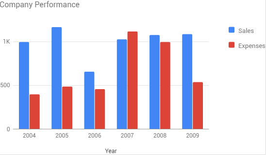 |
| BubbleChart | 气泡图 |  |
| Gauge | 仪表盘 | 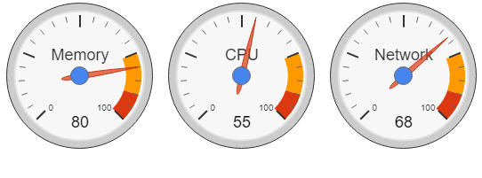 |
| GeoChart | 地理信息图 | 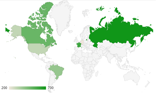 |
| LineChart | 线型图 | 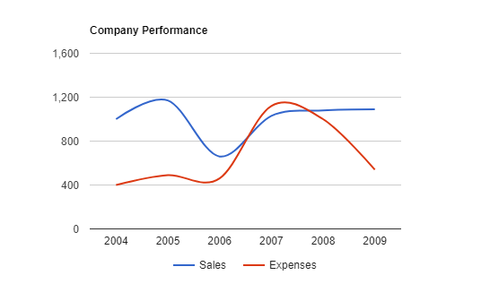 |
| PieChart | 饼图 |  |
# 9.1.2. ChartDataSet
property ChartDataSet: TDataSet;
设定数据来源的数据集控件名称。
# 9.1.3. ChartOptions
property ChartOptions: TStrings;
图表设置的相关选项。该选项以JSON格式进行存储。
- GeoChart选项 一个GeoChart选项设置如下:
displayMode: "region",
backgroundColor: "#81d4fa",
colorAxis: {colors: ["#00853f", "black", "#e31b23"]},
tooltip: {textStyle: {color: "#FF0000"}, showColorCode: true},
2
3
4
| 名称 | 说明 |
|---|---|
| displayMode | 地理图类型,数据表类型需与数据展示的类型相匹配,支持以下类型:auto:根据数据表的类型自动选择regions:可为区域上色的地理图markers:在区域内放置标记text:为区域标记数据表中的文本内容 |
| backgroundColor | 设置图表的背景颜色,可以是HTML定义的颜色,比如red或者#00cc00。 |
| colorAxis | 规定值地图的颜色列的数值 |
| tooltip | 提示工具的相关选项 |
如需要更详细的设置选项以实现自定义图表,点击GoogleChart GeoChart文档 (opens new window)查阅。
- PieChart选项
一个PieChart选项设置如下:
title: "My Daily Activities (1)",
tooltip: {textStyle: {color: "#FF0000"}, showColorCode: true},
2
| 名称 | 说明 |
|---|---|
| title | 标题名称 |
| tooltip | 提示框的相关选项 |
如需要更详细的设置选项以实现自定义图表,点击GoogleChart PieChart文档 (opens new window)查阅。
- Gauge选项
一个Gauge选项设置如下:
redFrom: 90, redTo: 100,
yellowFrom:75, yellowTo: 90,
minorTicks: 5
2
3
| 名称 | 说明 |
|---|---|
| redFrom | 显示红色区域的起始值 |
| redTo | 显示红色区域的终止值 |
| yellowFrom | 显示黄色区域的起始值 |
| yellowTo | 显示黄色区域的终止值 |
| minorTicks | 在两个显示数值的刻度之间设置的小刻度区域的数量 |
如需要更详细的设置选项以实现自定义图表,点击GoogleChart Gauge文档 (opens new window)查阅。
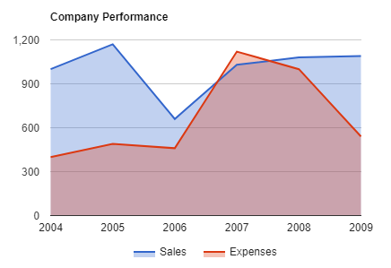
- Area Charts选项
一个Area Chart选项设置如下:
title: 'Company Performance',
curveType: 'function',
legend: { position: 'bottom' }
2
3
| 名称 | 说明 |
|---|---|
| title | 图表的标题名称 |
| curveType | 曲线类型function:函数曲线none:无类型 |
| lengend | 图表标签的选项 |
如需要更详细的设置选项以实现自定义图表,点击GoogleChart AreaChart文档 (opens new window)查阅。
- Bar Chart选项
一个Bar Chart选项设置如下:
title: 'Company Performance',
legend: { position: 'bottom' }
2
| 名称 | 说明 |
|---|---|
| title | 图表的标题名称 |
| lengend | 图表标签的选项 |
如需要更详细的设置选项以实现自定义图表,点击GoogleChart BarChart文档 (opens new window)查阅。
- Bubble Chart选项
一个Bubble Chart选项设置如下:
title: 'Correlation between life expectancy',
        hAxis: {title: 'Life Expectancy'},
        vAxis: {title: 'Fertility Rate'},
        bubble: {textStyle: {fontSize: 11}}
2
3
4
| 名称 | 说明 |
|---|---|
| title | 图表的标题名称 |
| hAxis | 设置横轴的标题名称 |
| vAxis | 设置纵轴的标题名称 |
| bubble | 设置气泡内的样式 |
如需要更详细的设置选项以实现自定义图表,点击GoogleChart BubbleChart文档 (opens new window)查阅。
- Line Chart选项
一个Line Chart选项设置如下:
title: 'Company Performance',
curveType: 'function',
legend: { position: 'bottom' }
2
3
| 名称 | 说明 |
|---|---|
| title | 图表的标题名称 |
| curveType | 曲线类型function:函数曲线none:无类型 |
| lengend | 图表标签的选项 |
如需要更详细的设置选项以实现自定义图表,点击GoogleChart LineChart文档 (opens new window)查阅。
# 9.2. 方法
# 9.2.1. LoadChart
procedure LoadChart;
该方法用于初始化并加载图表。
# 10. TUgFSKendoUI
该组件为图表显示组件,可用于图表数据的分析结果的汇总展示。
10.2.1. 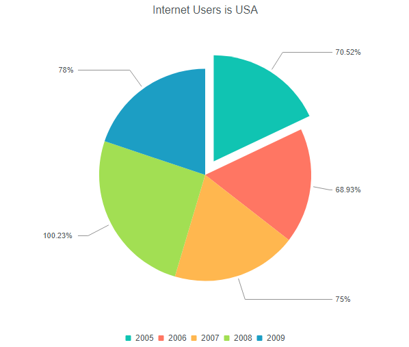
# 10.1. 属性
| 属性 | 功能说明 |
|---|---|
| ChartDataSet | 设置图表绑定的数据集的名称 |
| ChartLengendPosition | 设置图表铭牌的位置 |
| ChartNameExport | 设置图表导出时使用的文件名称 |
| ChartSeries | 设置数据系列 |
| ChartSeriesDefaults | 设置数据系列的默认取值 |
| ChartSeriesProperties | 设置数据系列的选项 |
| ChartStacked | 设置堆栈 |
| ChartTheme | 设置图表的主题 |
| ChartTitle | 设置图表标题 |
| ChartType | 设置图表类型 |
# 10.1.1. ChartDataSet
property ChartDataSet: TDataSet;
设置图表绑定的数据集控件的名称。
# 10.1.2. ChartLengendPosition
property ChartLegendPosition: TUgFSKendoUIPosition;
设置图例说明的显示位置。
# 10.1.3. ChartNameExport
property ChartNameExport: string;
设置导出文件的图表名称。
# 10.1.4. ChartProperties
property ChartProperties: TStrings;
设置图表的相关属性。
//JScript
UgFSKendoUI01.ChartProperties.Values["valueAxis"] = "{labels: {format: \"0:c\"}}";
2
//PasScript
UgFSKendoUI01.ChartProperties.Values['valueAxis'] := '{labels: {format: "0:c"}}';
2
// Make sure to add code blocks to your code group
关于属性设置的相关内容可以参考KendoUI属性文档 (opens new window)进行配置,选择对应的图表类型后进行查询。除以下属性外的剩余选项(通常处于JSON配置的末尾)可作为该属性的内容进行填充。
# 10.1.5. ChartSeries
property ChartSeries: TStrings;
设置数据系列。关于该内容可参考KendoUI属性文档 (opens new window)进行配置,选择对应的图表类型后进行查询。配置为series部分的内容可用于该属性的设置选项。
//JScript
UgFSKendoUI01.ChartSeries.Values["Mundo"] = "world_users";
2
//PasScript
UgFSKendoUI01.ChartSeries.Values['Mundo'] := 'world_users';
2
// Make sure to add code blocks to your code group
# 10.1.6. ChartSeriesDefaults
property ChartSeriesDefaults: string;
设置数据系列的默认值。关于该内容可参考KendoUI属性文档 (opens new window)进行配置,选择对应的图表类型后进行查询。配置为seriesDefaults部分的内容可用于该属性的设置选项。
//JScript
UgFSKendoUI01.ChartSeriesDefaults := "labels: {visible: true, position: \"insideEnd\", format: \"0:c\"}";
2
//PasScript
UgFSKendoUI01.ChartSeriesDefaults := 'labels: {visible: true, position: "insideEnd", format: "0:c"}';
2
// Make sure to add code blocks to your code group
# 10.1.7. ChartSeriesProperties
property ChartSeriesProperties: TStrings;
设置数据系列的选项。关于该内容可参考KendoUI属性文档 (opens new window)进行配置,选择对应的图表类型后进行查询。配置在series中的选项的展开选项项目可用于该属性的选项设置。
//JScript
UgFSKendoUI01.ChartSeriesProperties.Values["United States"] := "labels: {visible: true, align: \"column\", format: \"{0}%\"}";
2
//PasScript
UgFSKendoUI01.ChartSeriesProperties.Values['United States'] := 'labels: {visible: true, align: "column", format: "{0}%"}';
2
// Make sure to add code blocks to your code group
# 10.1.8. ChartStacked
property ChartStacked: Boolean;
是否进行图表的堆叠。
# 10.1.9. ChartTheme
property ChartTheme: TUgFSKendoUITheme;
设置图表的主题风格。
# 10.1.10. ChartTitle
property ChartTitle: string;
设置图表标题。
# 10.1.11. ChartTitleVisible
property ChartTitleVisible: Boolean;
设置图表标题是否可见。
# 10.1.12. ChartType
property ChartType: TUgFSKendoUIType;
设置图表的类型。
| 名称 | 说明 | 图示 |
|---|---|---|
| Columns | 纵向柱状图 | 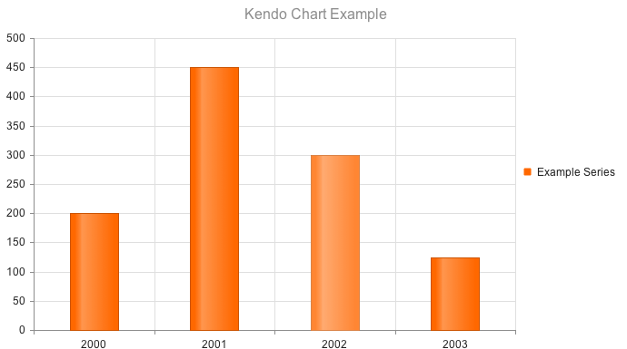 |
| Bar | 横向柱状图 | 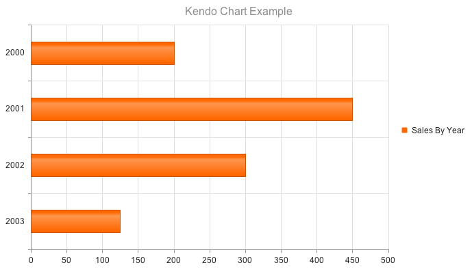 |
| Line | 折线图 | 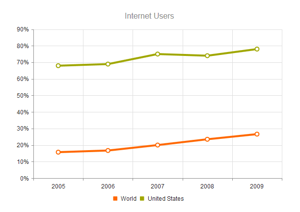 |
| Pie | 饼图 |  |
| Scatter | 散点图 |  |
| ScatterLine | 散点连线图 |  |
# 10.2. 方法
# 10.2.1. InitChart
procedure InitChart;
初始化设置图表并打开。
# 11. TUgFSConfirm
此控件用于设定显示确认的提示对话框。

# 11.1. 属性
| 属性 | 功能说明 |
|---|---|
| BackgroundDismiss | 设置点击背景时是否忽视操作 |
| boxWidth | 设置显示的提示框的宽度 |
| ButtonEnterConfirm | 设置按下enter按键表示为确认 |
| ButtonTextCancel | 设置取消按钮上显示的文本内容 |
| ButtonTextConfirm | 设置确认按钮上显示的文本内容 |
| ButtonTextOK | 设置OK按钮上显示的文本内容 |
| ButtonTextOther | 设置Other按钮上显示的文本内容 |
| CloseIcon | 设置是否显示关闭按钮 |
| Content | 设置提示框中显示的正文的内容 |
| Draggable | 设置提示框是否可以被鼠标拖动 |
| EscapeKey | 设置控件是否响应esc按键 |
| Icon | 设置显示的字体图标,所有可用的文本图标的样式请查阅https://fontawesome.com/v5.0/icons (opens new window) |
| PromptType | 如果提示框需要用户输入信息以进行确认提示的,则可设置其中的相关选项 |
| ScreenMask | 设置是否使用屏幕提示的友好信息框 |
| Theme | 设置提示框显示的主题 |
| Title | 设置提示框的标题内容 |
| TypeAnimated | 设置输入框中的内容是否以动画方式显示 |
| TypeColor | 设置输入框中主题显示的颜色 |
| TypeConfirm | 设置输入确认提示框的样式 |
# 11.1.1. PromptType
property PromptType: TUniFSPromptType;
设置需要输入的提示框中的相关信息。
| 名称 | 说明 |
|---|---|
| CharCase | 设置文字的大小写类型Normal_:设置文字为正常模式,即保持所有文字默认的大小写情形LowerCase_:所有的英文字符均转换为小写UpperCase_:所有的英文字符均转换为大写 |
| RequireField | 是否设置文字输入为必须操作 |
| TextRequireField | 设置文字输入为必须操作的提示信息 |
| TypePrompt | 设置输入的文字显示的类型text:设置显示为文本类型password:设置显示为密码字符类型 |
# 11.1.2. ScreenMask
property ScreenMask: TUniFSScreenMask;
设置屏幕友好提示信息,用于在处理过程中的显示内容。
| 名称 | 说明 |
|---|---|
| Enabled | 设置是否启用遮罩的功能 |
| Text | 设置屏幕遮罩上显示的文本内容 |
# 11.2. 事件
# 11.2.1. OnAlert
procedure UgFSConfirm01OnAlert(confirmbutton: tconfirmbutton);
当在警告的对话框中按下确认按钮后触发事件。
# 11.2.2. OnConfirm
procedure UgFSConfirm01OnConfirm(confirmbutton: tconfirmbutton);
当在确认的对话框中按下确认按钮后触发事件。
# 11.2.2.1. OnPrompt
procedure UgFSConfirm01OnPormpt(confirmbutton: tconfirmbutton;result: string);
当在输入的对话框中按下确认按钮后触发事件,result中存储输入的文本内容。
# 11.3. 方法
# 11.3.1. Clear
procedure Clear;
设置清除内容。
# 11.3.2. ShowMask
procedure ShowMask(Msg: string);
调用显示相关信息的遮罩。
# 11.3.3. ShowMaskPercent
procedure ShowMaskPercent(Msg: string; Percent: Integer);
设置显示包含进度条信息的遮罩。
# 11.3.4. ShowMaskJSName
procedure ShowMaskJSName(Msg: string; JSName: string);
调用指定控件JS的遮罩信息。
# 11.3.5. ShowMaskUpdate
procedure ShowMaskUpdate(Msg: string; Percent: Integer);
当遮罩启用时设置遮罩的百分比数值更新。
//JScript
  try{
    UgFSConfirm01.ShowMaskPercent("Starting Processing...",10);
    Sleep(2000);
    UgFSConfirm01.ShowMaskUpdate("Creating Order...",25);
    Sleep(2000);
    UgFSConfirm01.ShowMaskUpdate("Processing Payment...",70);
    Sleep(2000);
    UgFSConfirm01.ShowMaskUpdate("Ending Asking...",90);
    Sleep(1000);
    UgFSConfirm01.ShowMaskUpdate("Ending Asking...",100);
    Sleep(1000);
    UgFSConfirm01.Alert("Thanks for the purchase","Order 561560");
  }
  finally{
    UgFSConfirm01.RemoveMask;
  }
2
3
4
5
6
7
8
9
10
11
12
13
14
15
16
17
//PasScript
  //更新进度的设置
  try
    UgFSConfirm01.ShowMaskPercent('Starting Processing...',10);
    Sleep(2000);
    UgFSConfirm01.ShowMaskUpdate('Creating Order...',25);
    Sleep(2000);
    UgFSConfirm01.ShowMaskUpdate('Processing Payment...',70);
    Sleep(2000);
    UgFSConfirm01.ShowMaskUpdate('Ending Asking...',90);
    Sleep(1000);
    UgFSConfirm01.ShowMaskUpdate('Ending Asking...',100);
    Sleep(1000);
    UgFSConfirm01.Alert('Thanks for the purchase','Order 561560');
  finally
    UgFSConfirm01.RemoveMask;
  end;
2
3
4
5
6
7
8
9
10
11
12
13
14
15
16
17
// Make sure to add code blocks to your code group
# 11.3.6. RemoveMask
procedure RemoveMask;
如果当前正在显示遮罩,使用此方法可移除遮罩。
# 11.3.7. Alert
procedure Alert(const Title: string; const Content: string);
设置警告提示信息。
# 11.3.8. Prompt
procedure Prompt(const Title: string; const Msg: string);
设置文本的输入信息。
# 11.3.9. Question
procedure Question(const Title: string; const Content: string; TP: TTypeConfirm);
显示提问类型的对话框。
# 11.3.10. Mask
procedure Mask(const Msg: string);
显示遮罩。